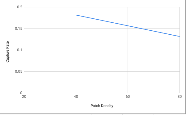
(This graph is comparing the Capture Rate to the Patch Density. Usually, when optimal foraging is exhibited, the graph for Capture Rate should be increasing with the increase of Patch Density. This graphs error can be attributed to the fact that the “prey” was not mixed enough) 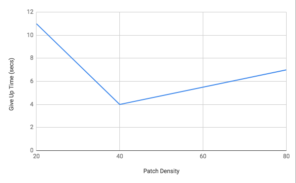
(This graph is compare the G.U.T or give up time to the Patch Density. The Give Up Time should be increasing as Patch Density increases, but again, this graphical error can be contributed to the availability of the beans in the buckets)
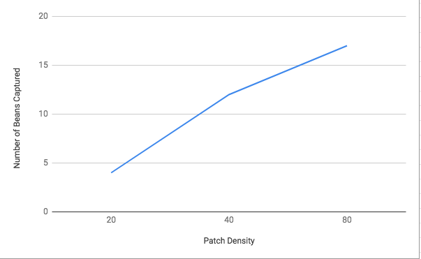
(This graph is compares the number of beans captured to the Patch Density. Theoretically, the Number of Beans captured should increase as the Patch Density increase. This graph illustrates this idea for the most part.) 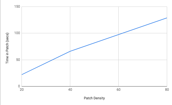
This Graph illustrates the increase of time spent in each patch compared to the Patch Density. The graph shows the increase of time correlating with the increase of the Patch Density.)
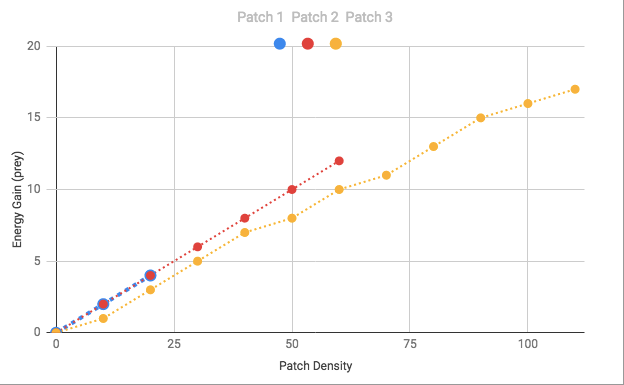
(This is the Cumulative Curve Graph. By evaluating this graph, we are able to tell if the organism is exhibiting optimal foraging. In Patch 1 and Patch 2, the organism seem to have ending foraging too early. However in Patch 3, we can start to see the curve that shows the maximum net gain of energy.)


